MyWorth
Clear Financial Guidance for Women on a Mission
Bridging the confidence gap between women and their money.
Overview
myWorth was founded on a clear and urgent premise: women are systematically underserved by the financial industry – in products, in language, and in representation. The platform set out to change that by building a media-driven community that made financial wellness feel accessible, relevant, and genuinely inspiring. I joined as the product design lead through AdvisorConnect, owning the end-to-end UX and UI – from information architecture and engagement strategy to the landing page, financial assessment flow, and visual identity. The goal wasn't to build another personal finance tool. It was to build a place women actually wanted to return to.
Problem Space
Understanding the challenge.
Business Challenge and User Pain Points.
Business Challenge
Launching a new content and community platform in a crowded digital media landscape required more than good content – it required a product experience compelling enough to convert a first visit into a habit. The founding team had a strong editorial vision and a clear mission, but needed a UX strategy that could translate that mission into an experience architecture: how do you sequence content, community, and financial tools in a way that builds trust before asking anything of the user? The platform also needed to establish brand credibility quickly enough to attract event partnerships and industry presence within the first quarter.
User Pain Points
The target audience – women navigating financial decisions with limited confidence and often limited prior education – brought a complex emotional context to every interaction. Money carries shame, anxiety, and deep-seated beliefs about who gets to be 'good with finances.' A platform that led with jargon, judgment, or complexity would lose its audience in the first scroll. The design challenge was to create an experience that felt like a trusted friend who happened to know a lot about money – warm, direct, and completely non-intimidating.
Constraints
As a startup, myWorth needed to launch with a lean product that could generate organic growth quickly. Every design decision had to earn its place: there was no room for features that looked good but didn't drive engagement or return visits. The content model – evergreen articles, a three-times-weekly newsletter, downloadable resources, and a quarterly sweepstakes – had to be woven into the UX architecture without creating cognitive overload for a user who might be visiting for the first time.
Research
How we listened.
Key Insights
- 1Women didn't avoid financial content because they weren't interested – they avoided it because most financial content wasn't designed for them
- 2Trust had to be established before any financial assessment or data collection – the sequence of content and action mattered enormously
- 3Community and peer validation were as powerful as expert content – women wanted to know other women were navigating the same questions
- 4The newsletter was a trust-building mechanism as much as a content channel – frequency and tone set expectations for the whole relationship
Strategy
Building on familiar mental models.
Reviewers already know invoices. We designed the digital experience to feel like one, then layered progressive disclosure and transparency on top. Rather than introducing a new paradigm, the interface anchored to something billing teams had used for years, reducing the learning curve and lowering the activation energy required to trust a new automated system.
Familiarity
The mental model of a paper invoice grounded the interface: layout, hierarchy, and terminology borrowed from what users already understood.
Progressive disclosure
Show the validation result first; reveal the source detail on demand. Confidence before complexity.
Transparency
Every automated decision is attributable to a data source, with plain-language explanations of what matched, what didn't, and why.
Process
How we got there.
UX Strategy & Information Architecture
Began by mapping the full content and product ecosystem – evergreen content, newsletter, financial assessment, sweepstakes, and downloadable resources – and defining how each element connected to the others. Established an IA that could guide a first-time visitor toward deeper engagement without overwhelming them, and gave returning users clear paths to what they came back for.
Landing Page Design
Authored the landing page UX and UI as the platform's first impression and primary acquisition surface. Designed to communicate the mission instantly, establish emotional resonance before introducing any financial content, and funnel visitors toward newsletter sign-up – the highest-value conversion action for an early-stage media platform.
Engagement Strategy
Designed the financial assessment experience as a low-friction, judgement-free entry point into personalised content and resources. The flow needed to feel like a conversation, not an application – collecting enough information to personalise the experience without triggering the anxiety that comes from traditional financial intake forms.
Optimization Strategy
Developed the full engagement model: how the newsletter cadence, sweepstakes mechanics, campaigns, and downloadable resources worked together to create reasons to return. Each touchpoint was designed to deepen the relationship with the platform incrementally – trust first, financial action second.
Visual Identity & Brand Expression
Created a visual design language that balanced the authority needed to be taken seriously on financial topics with the warmth required to reach women who had been excluded from that conversation. Typography, colour, imagery, and tone worked together to create something that felt neither like a bank nor a lifestyle blog – but a confident, caring community.
Solution
What we built.
We built a media-driven community platform that met women at the emotional entry point – content-first, jargon-free, and structured to build trust before asking anything. Every surface was designed to make financial wellness feel like something women had access to.
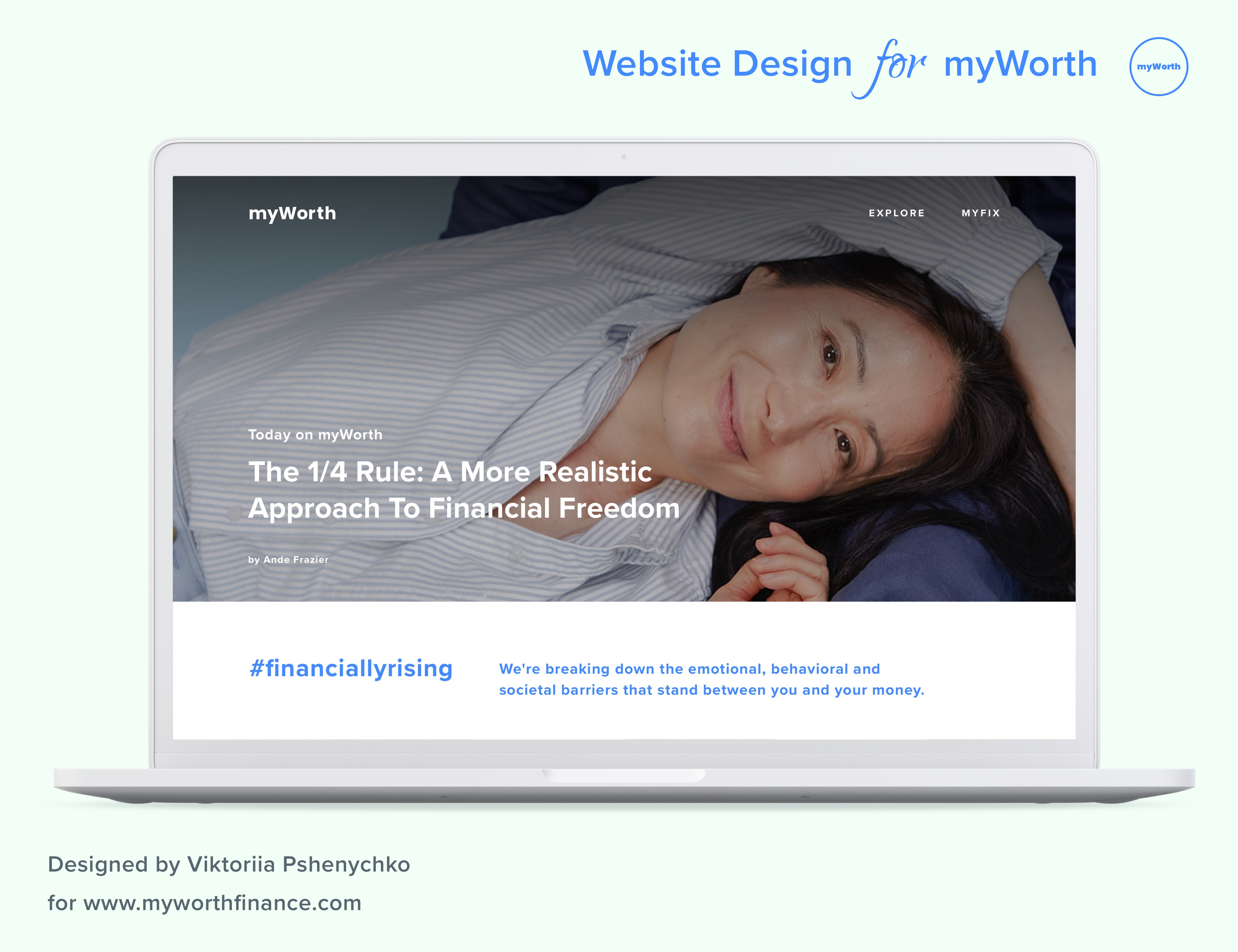
Editorial Homepage
The landing page established the mission instantly – editorial photography, an empathetic voice, and #financiallyrising as a rallying point. Designed to convert a first visit into a newsletter subscription before asking anything else of the user.
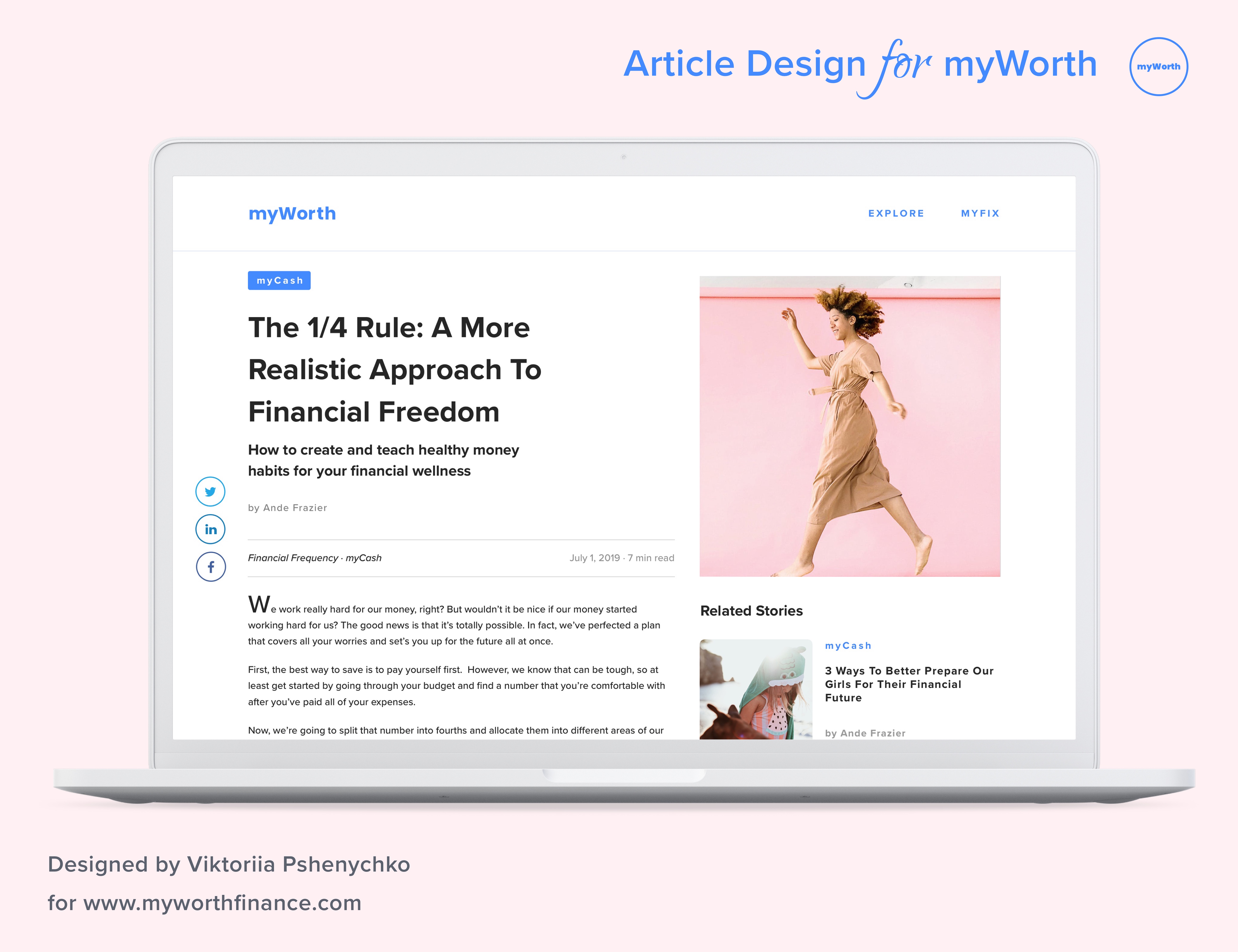
Article Experience
A clean editorial layout put content first – clear category tags (myCash, myCareer), author attribution, read time, and related stories that encouraged deeper exploration without overwhelming a reader who might be new to the topic.
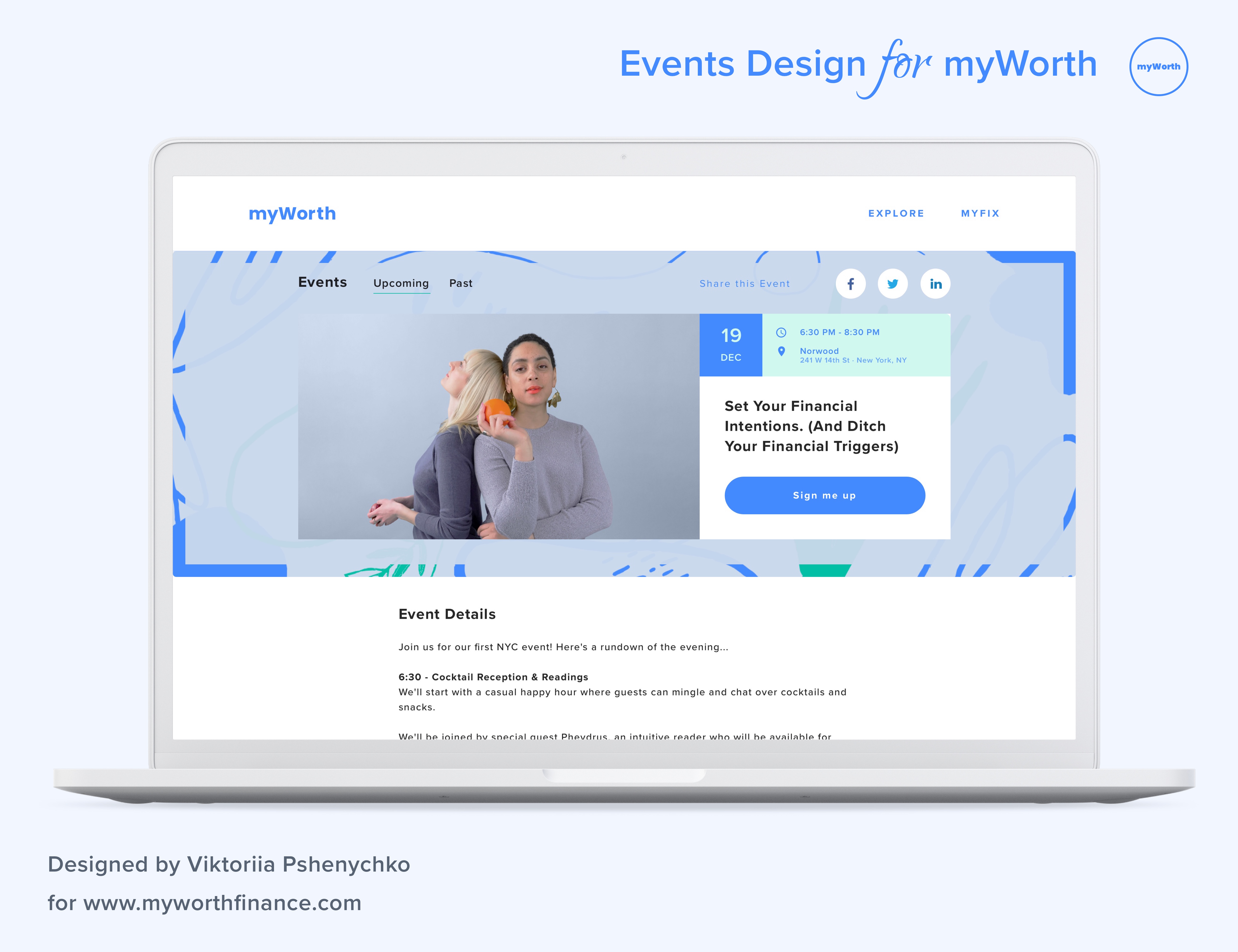
Community Events
The events platform brought the digital community into the physical world – connecting women at live NYC events framed around financial topics with an emotional, not instructional, tone. Sign-up was one click.
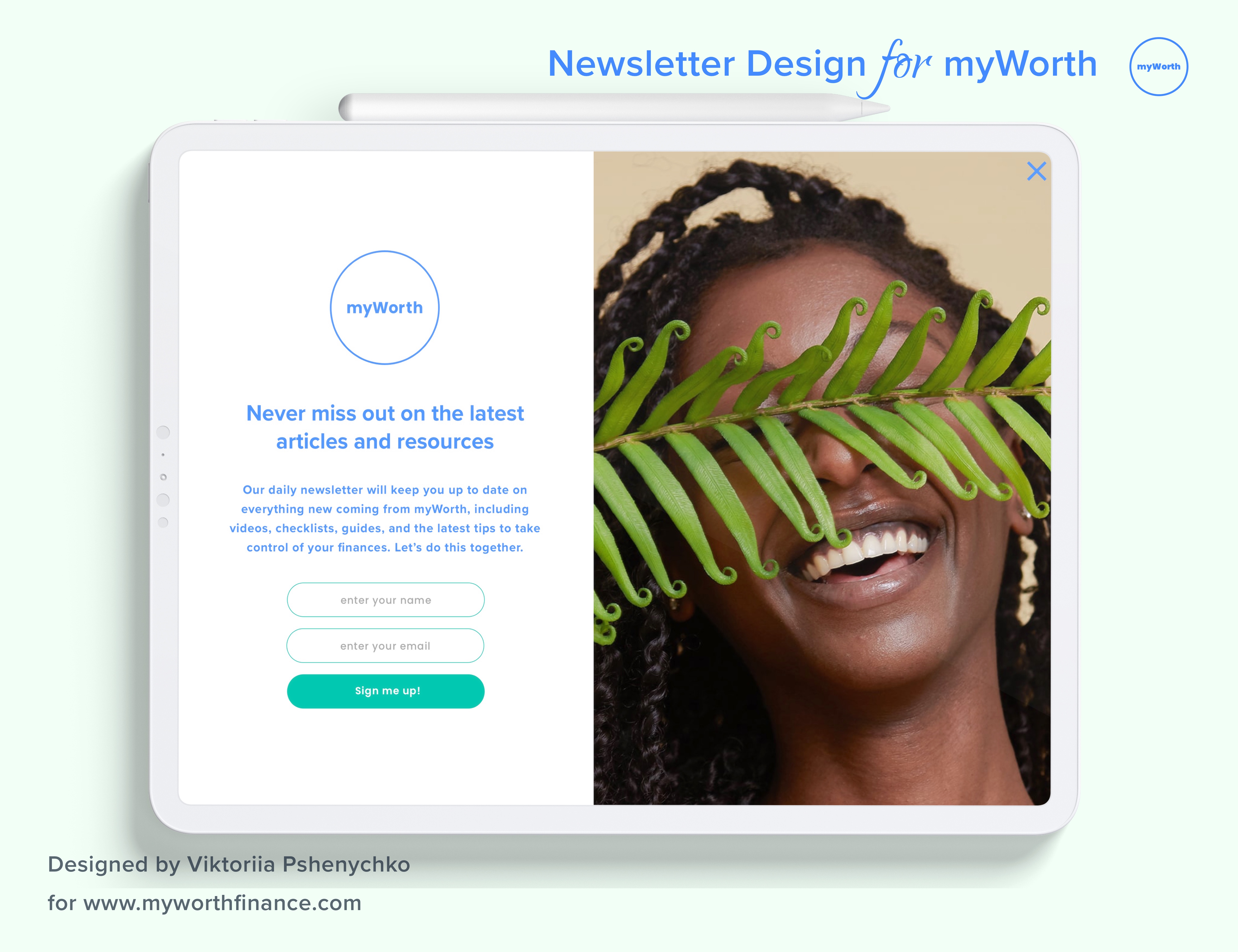
Newsletter & Engagement
The newsletter was a trust-building relationship as much as a content channel. A frictionless signup modal – warm copy, minimal fields – fed a three-times-weekly cadence that kept 20K monthly users returning between visits.
Assessment Prototype
Explore the flow.
An 11-step financial assessment designed to feel like a conversation, not a form – surfacing personalised wellness resources without triggering the anxiety of a traditional financial intake.
View Assessment Flow
11 screens · Financial assessment · Personalised results
Impact
Business outcomes across the enterprise.
Reached 20,000 monthly active users following launch
Generated approximately 5,000 organic followers within the first 3 months
Established strong brand presence at company and industry events within the first quarter
Sustained newsletter cadence with evergreen content, resources, and campaigns
“Bridge the confidence gap between women and their money so that they can take informed action toward financial wellness.
Reflection
What I learned.
Worth reminded me that the most important design work sometimes happens before the first wireframe. The real design challenge here wasn't the landing page or the assessment flow – it was defining what kind of place myWorth would be. What would it feel like to be there? What would it never say? What would it always make you feel? Those questions shaped every visual and structural decision that followed. I also think about this project in the context of who gets to feel confident about money. Financial literacy content has historically been written for people who are already financially literate – it assumes a baseline of comfort and vocabulary that many women have never been given access to. Designing for myWorth meant questioning every assumption about what financial content should sound like, look like, and feel like. The 20K monthly users who showed up at launch weren't just validating a product – they were showing up for a conversation that the industry had never bothered to have with them.