Alike
Designing a Peer Support Platform for Cancer Survivors & Patients
Designing a space where young adults with cancer find each other – and themselves.
Overview
Alike is a UK-based charity built for young adults impacted by cancer – a group chronically underserved by existing support structures. The founder, a cancer survivor herself, had a clear vision: a peer-led digital community where people could connect not around their diagnosis, but around who they are. I was brought in through Toptal as a freelance UX designer to shape the iOS app experience from the ground up – no brief, no prior design, just a founder with a mission and a prototype deadline. The work needed to be fast, sensitive, and exactly right. The prototype would determine whether the nonprofit could secure the funding to become real.
Problem Space
Understanding the challenge.
Business Challenge and User Pain Points.
Business Challenge
The founder needed a high-fidelity iOS prototype compelling enough to attract investors and donors to a nonprofit that didn't yet exist in digital form. The design had to communicate trustworthiness, emotional safety, and clear utility – simultaneously to two audiences: the young adults who would use it and the funders who needed to believe in it. There was no room for a version one that felt rough.
User Pain Points
Young adults with cancer occupy an emotional space that most digital products aren't designed for – somewhere between vulnerability and fierce independence. They don't want to be defined by their diagnosis. They want connection that feels human first, medical second. Research with the founder – herself a peer of the intended users – revealed that the most dangerous design decision would be leading with cancer type. That information, shown too soon, reduces a whole person to a condition. The app needed to show the person first.
Constraints
The project was a two-person operation: one designer, one founder. Every decision needed to move quickly and carry weight. iOS design conventions had to be respected to make the prototype feel credible and native – a rough prototype could undermine donor confidence. The subject matter required emotional sensitivity that typical UX frameworks don't account for – language, imagery, and interaction patterns all carried more consequence than in a commercial product.
Research
How we listened.
Key Insights
- 1Cancer type should not appear on initial peer profiles – it doesn't define a person, it's a temporary struggle
- 2The app needed to feel inviting, genuine, safe, and uplifting – four qualities rarely found together in health-adjacent products
- 3Peer connection needed to feel chosen, not assigned – users needed agency in who they reached out to
- 4Onboarding was the highest-stakes moment: if it felt clinical or bureaucratic, trust would never recover
Strategy
Building on familiar mental models.
Reviewers already know invoices. We designed the digital experience to feel like one, then layered progressive disclosure and transparency on top. Rather than introducing a new paradigm, the interface anchored to something billing teams had used for years, reducing the learning curve and lowering the activation energy required to trust a new automated system.
Familiarity
The mental model of a paper invoice grounded the interface: layout, hierarchy, and terminology borrowed from what users already understood.
Progressive disclosure
Show the validation result first; reveal the source detail on demand. Confidence before complexity.
Transparency
Every automated decision is attributable to a data source, with plain-language explanations of what matched, what didn't, and why.
Process
How we got there.
Experience Strategy
Worked directly with the founder to define a three-step experience strategy: connect with the community, find your peer, stay engaged. Every feature decision mapped back to one of these three moments. This framework kept the prototype focused and made the investor narrative coherent.
Persona & Journey Mapping
Developed personas grounded in the founder's lived experience and extended through secondary research on young adult cancer patients. Mapped the emotional journey from diagnosis through isolation to first meaningful peer connection – identifying the moments where the app could intervene with the most impact.
Onboarding Design
Designed an onboarding flow that introduced Alike as a team – a community of people who understand – before asking anything of the user. The tone was warm and peer-voiced, not clinical. The goal was to make the user feel seen before they'd shared a single detail about themselves.
Peer-Matching Interface
Designed the core peer-meeting experience around profile cards showing name, age, location, and interests – deliberately leading with life, not illness. Users could say hi, send a message, or pass without friction. The interaction pattern was familiar enough to feel safe but purposeful enough to feel different from social media.
Engagement Features
Designed the engagement layer – peer posts, podcasts, and curated media resources – to give users reasons to return even when they weren't ready to reach out directly. Content became a gentler entry point into community.
Solution
What we built.
We designed a high-fidelity iOS app that put the person before the patient. Three core experiences – a warm onboarding flow, a person-first peer-matching interface, and a content-driven community feed – worked together to make connection feel safe, chosen, and genuinely human.
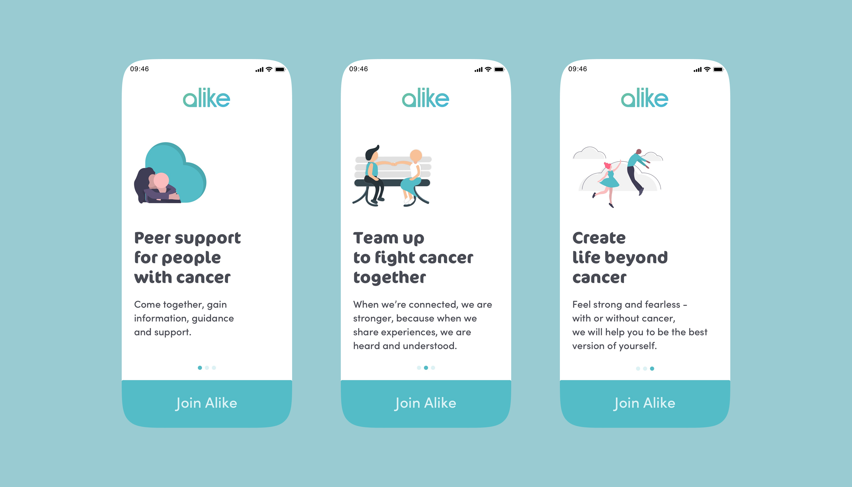
Warm, Peer-Voiced Onboarding
Three onboarding screens introduced Alike as a community of people who understand – before asking anything of the user. The tone was peer-voiced, not clinical. Illustrations and copy were deliberately warm, positioning the app as a companion, not a tool.
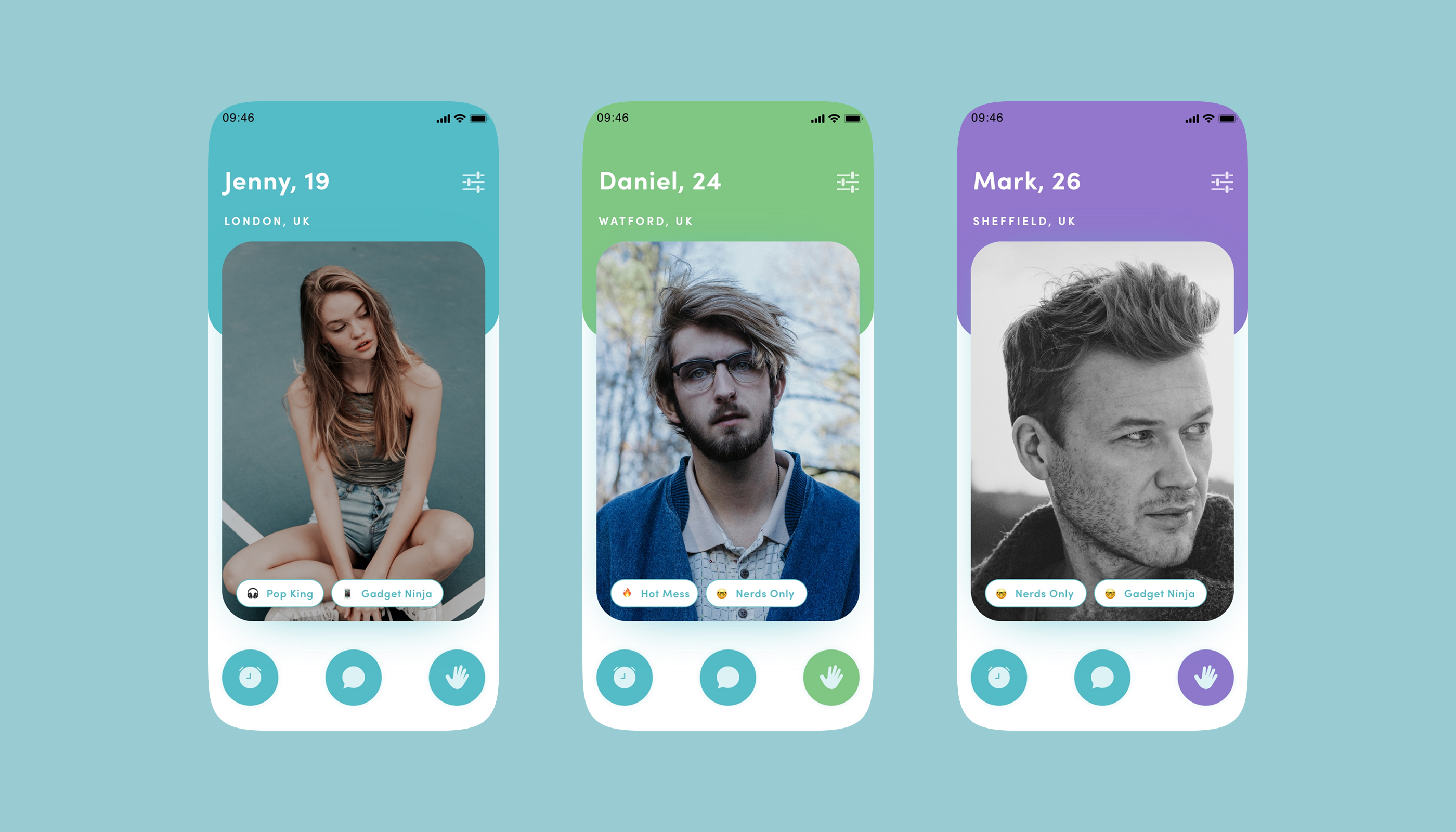
Person-First Peer Cards
Peer profiles led with name, age, location, and personal interests – never with diagnosis. Users could say hi, send a message, or pass without friction. The card design made connection feel chosen and human, not clinical or assigned.
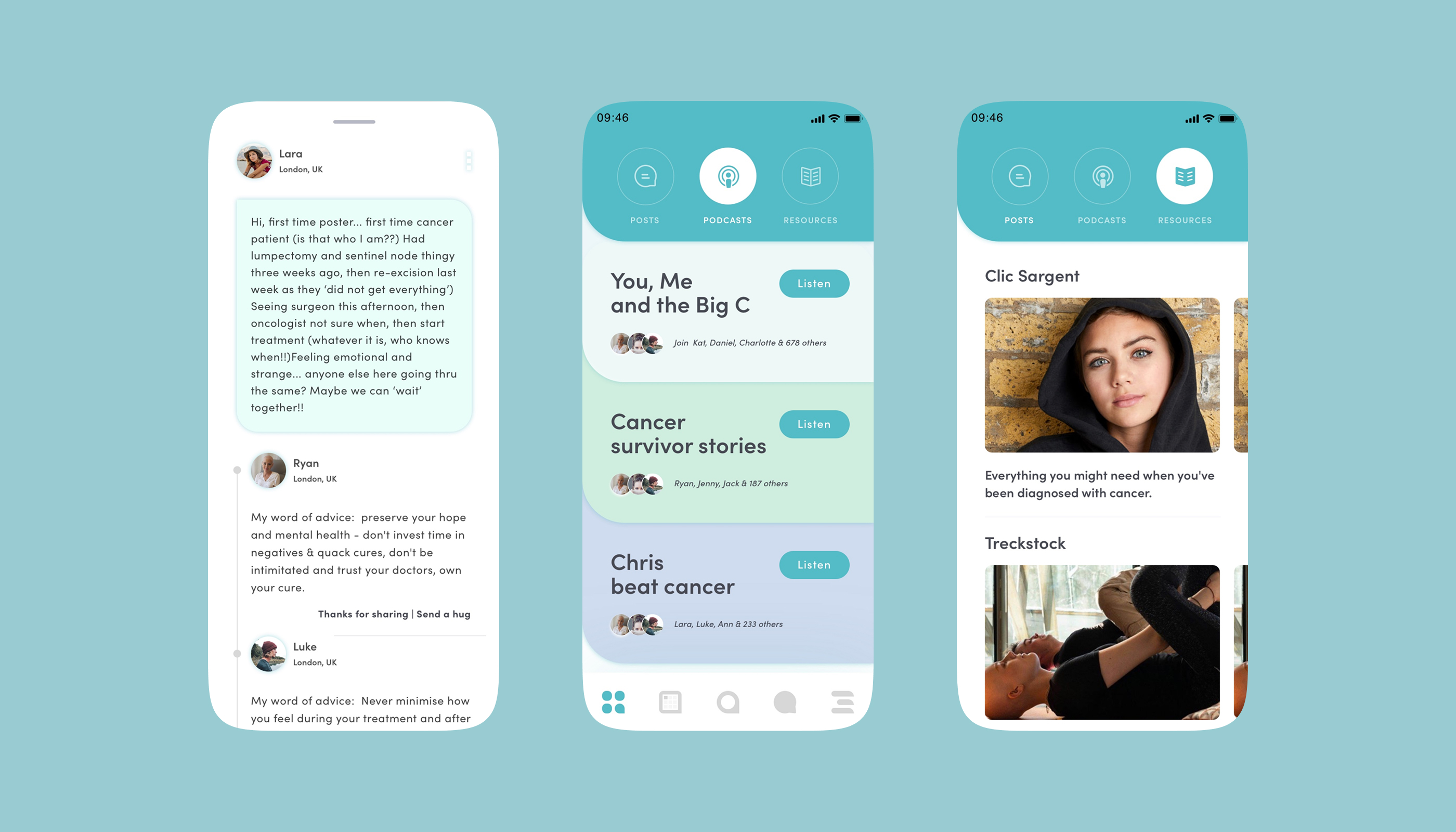
Community & Content Feed
Posts, podcasts, and curated resources gave users a low-effort entry point into community – especially for those not yet ready to reach out directly. Content became the gentler on-ramp to genuine peer connection.
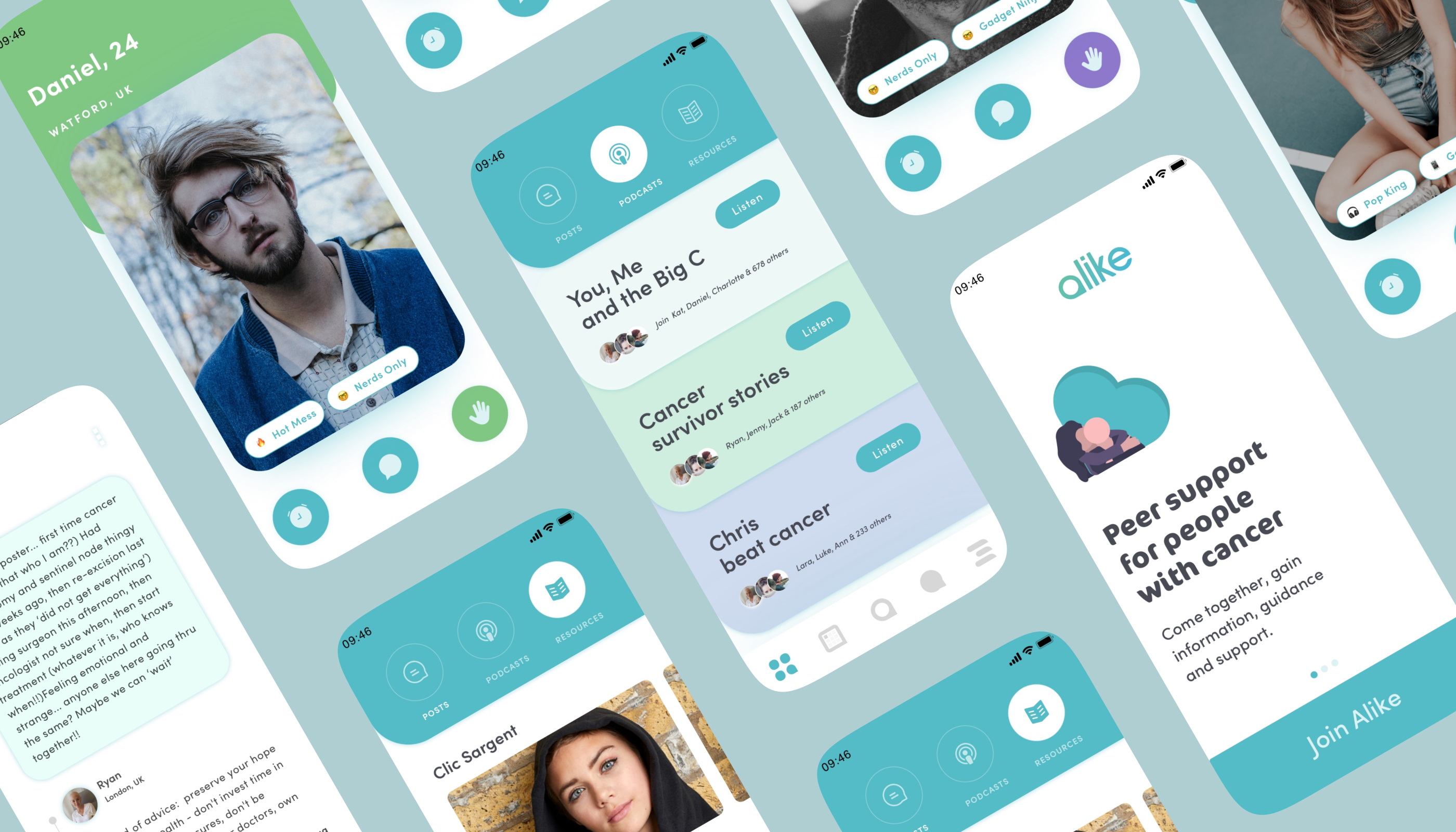
A Complete iOS Experience
The full prototype delivered a native-feeling iOS app – credible enough to secure investor confidence and emotionally considered enough to feel safe for the young adults it was built for. Every interaction pattern respected the sensitivity of the subject matter.
Impact
Business outcomes across the enterprise.
Complete high-fidelity iOS prototype launched on schedule
Founder successfully launched Alike as a registered nonprofit
Prototype attracted initial investors and donor funding for operations
Entire UX conceived, designed, and prototyped from a blank canvas
“It doesn't define a person – it is just a temporary struggle.
Reflection
What I learned.
Kindred is the project I return to when I need to remember why UX design matters. Not because it was the most complex system I've designed – it wasn't. But because the stakes were entirely human. Every micro-decision carried consequence: the order information appeared on a profile card, the words in a push notification, whether a button said 'maybe later' instead of 'skip.' These choices weren't about conversion rates. They were about whether someone navigating one of the hardest experiences of their life would feel safe enough to reach out to a stranger. The most important design decision we made – hiding cancer type from initial peer profiles – came directly from the founder's own experience of not wanting to be reduced to her diagnosis. That's a reminder I carry into every project: the people closest to the problem often hold the most important design insight. My job was to listen, translate, and build something worthy of the trust being placed in it.