AdvisorConnect
Streamlining Prospect Discovery for Financial Advisors
Replacing paper trails with a digital path from prospect to policy.
Overview
AdvisorConnect, Inc. was an InsureTech SaaS startup with a clear thesis: the reason financial advisors fail isn't lack of skill – it's a broken onboarding system. Before an advisor can sell, they must complete Project 200 (P200), a process of building an initial prospect list from their personal network. Historically done in paper booklets, then spreadsheets, P200 consumed months of unstructured effort and produced inconsistent results. High attrition followed. I joined as lead product designer at the founding stage, partnering directly with the founding team to take the platform from concept to a shipped product in the hands of enterprise clients including New York Life and Penn Mutual.
Problem Space
Understanding the challenge.
Business Challenge and User Pain Points.
Business Challenge
Enterprise insurance carriers were hemorrhaging new advisor talent within the first year – not because advisors lacked ability, but because the onboarding process was slow, unstructured, and impossible to manage at scale. Carrier managers had no visibility into where advisors were in their P200 progress, no way to coach remotely, and no data to identify who was struggling before they quit. AdvisorConnect needed to make the case to risk-averse Fortune 500 procurement teams that a startup SaaS product was worth replacing their existing – if dysfunctional – systems.
User Pain Points
Financial advisors were caught between two pressures: the urgency to start selling and the mandatory front-loaded work of building a prospect list. The P200 process felt disconnected from the job they were hired to do. Managers, on the other hand, were managing large field teams with minimal tooling – relying on phone check-ins and emailed spreadsheets to track progress. Both groups were experiencing the same problem from different angles: a process that consumed time without producing clarity.
Constraints
As a startup, the team was small and the runway finite – design decisions had to be implementable quickly and had to prioritize the features that enterprise buyers cared about most. Corporate security requirements from Fortune 500 partners introduced constraints on data handling and third-party API integrations. Access to field advisors for research and testing was limited by carrier policies, requiring creative research methods to compensate.
Research
How we listened.
Key Insights
- 1Advisors didn't resist the P200 process – they resisted the ambiguity of it. No one told them what good looked like or how far along they were.
- 2Managers spent more time chasing status updates than coaching – they needed visibility, not more reports to fill out.
- 3The emotional low point in the advisor journey came not at failure but during the waiting period after P200 submission – a black box of no feedback.
- 4Enterprise buyers needed to see the system working before they'd trust it – stakeholder visualization of the pipeline mattered as much as the product itself.
Strategy
Building on familiar mental models.
Reviewers already know invoices. We designed the digital experience to feel like one, then layered progressive disclosure and transparency on top. Rather than introducing a new paradigm, the interface anchored to something billing teams had used for years, reducing the learning curve and lowering the activation energy required to trust a new automated system.
Familiarity
The mental model of a paper invoice grounded the interface: layout, hierarchy, and terminology borrowed from what users already understood.
Progressive disclosure
Show the validation result first; reveal the source detail on demand. Confidence before complexity.
Transparency
Every automated decision is attributable to a data source, with plain-language explanations of what matched, what didn't, and why.
Process
How we got there.
Discovery & Journey Mapping
Mapped the full advisor onboarding journey from hiring through first sale, documenting the emotional highs and lows at each stage. This became the foundation for prioritizing which parts of the experience to redesign first and established a shared language between design, product, and engineering.
KPIs & North Star Definition
Worked with the founding team to define success metrics before designing anything. We established onboarding time reduction, advisor retention at 90 days, and manager-to-advisor coaching touchpoints as the core KPIs – ensuring every design decision could be evaluated against business outcomes.
Ideation & Competitor Analysis
Analyzed adjacent tools – LinkedIn Sales Navigator, Salesforce onboarding modules, HR platforms – to identify patterns that advisors already understood. Ran ideation sessions to explore how familiar paradigms could be adapted to the unique regulatory and social dynamics of the insurance industry.
User Flow & Wireframing
Designed parallel flows for two primary users: the advisor completing P200 and the manager overseeing their team's progress. Wireframes went through two rounds of internal review and one round of proxy testing before progressing to high-fidelity design.
Design System & Component Library
Built a lightweight but scalable design system to support consistent output across a mobile-friendly web and native product suite. Component-driven design enabled faster handoff and gave the small engineering team clear implementation guidance.
Pilot Launch & Iteration
Supported the launch of pilot programs with enterprise partners, establishing feedback loops between advisors in the field, carrier managers, and the product team. Post-launch observations fed directly into the next design iteration cycle.
Solution
What we built.
We replaced the paper P200 process with a mobile-first networking platform – an intelligent onboarding flow that turned the advisor's existing personal network into a structured, actionable prospect pipeline in under 15 minutes.
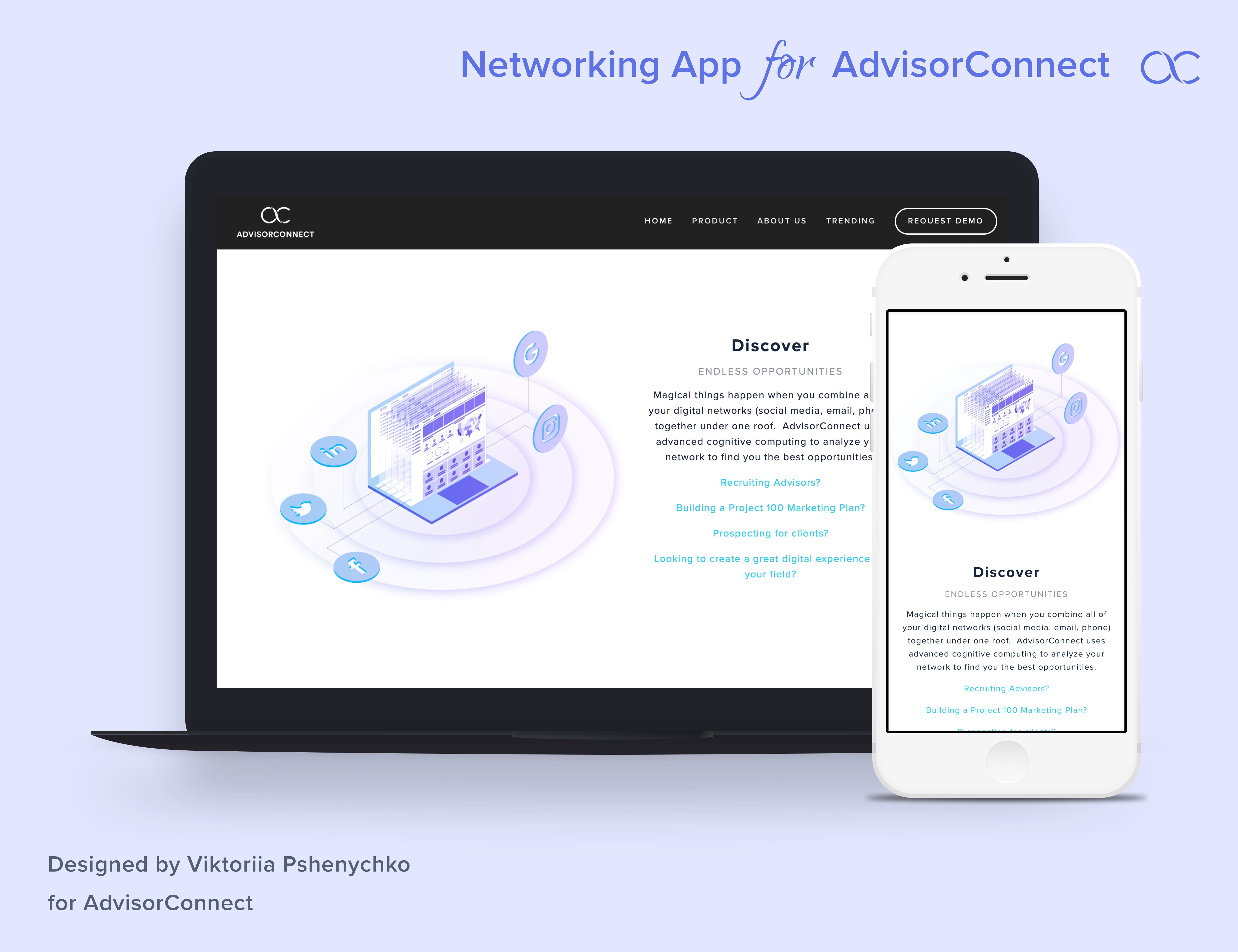
Zero-Friction Onboarding
Social sign-in replaced the blank form. Advisors authenticated with their existing accounts – Facebook, Google, Twitter – and their networks became the starting point, not an afterthought.
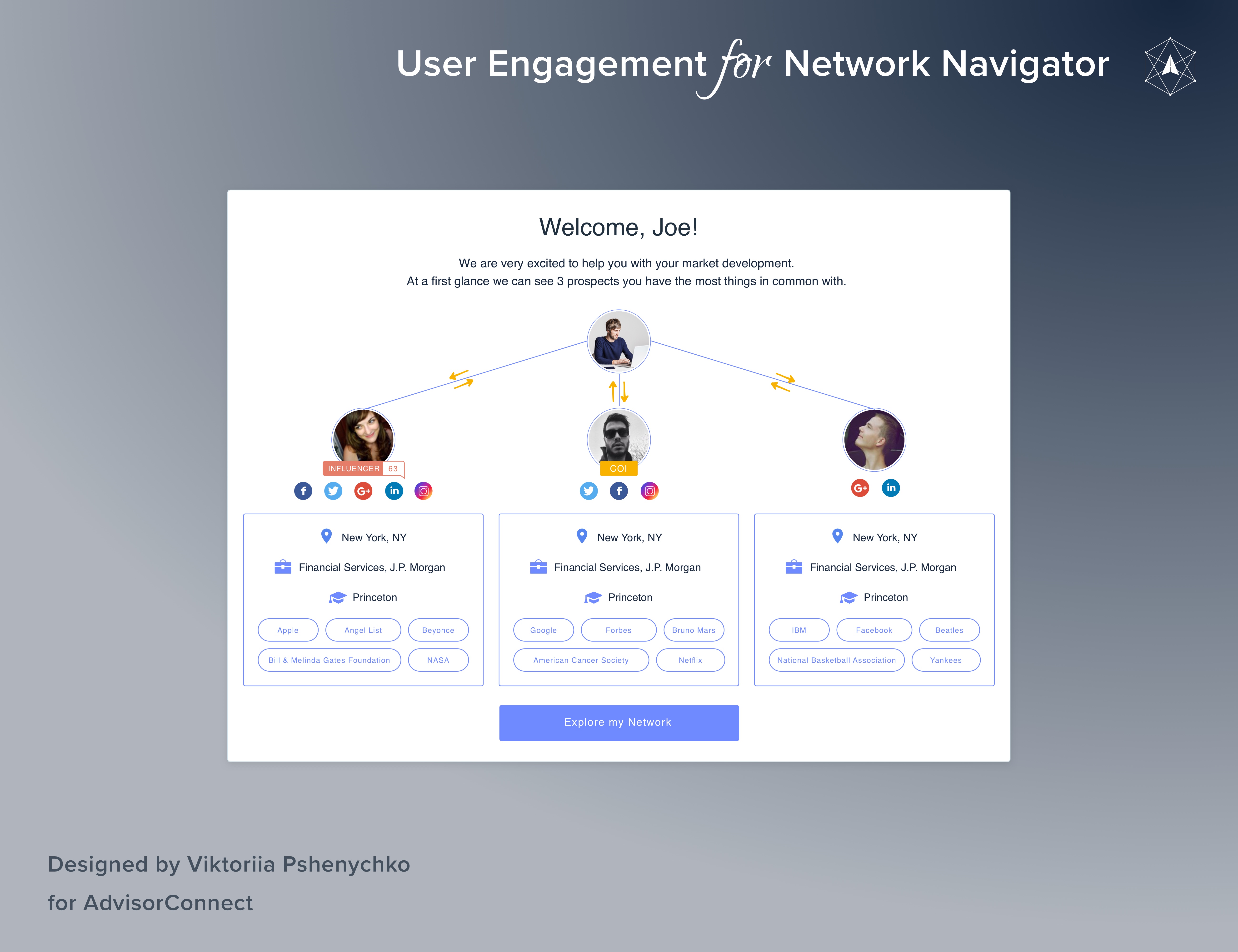
Ideal Client Builder
A progressive questionnaire – age group, geography, industry – replaced the open-ended ambiguity of the P200 booklet. Advisors defined exactly who they were looking for, and the system matched accordingly.
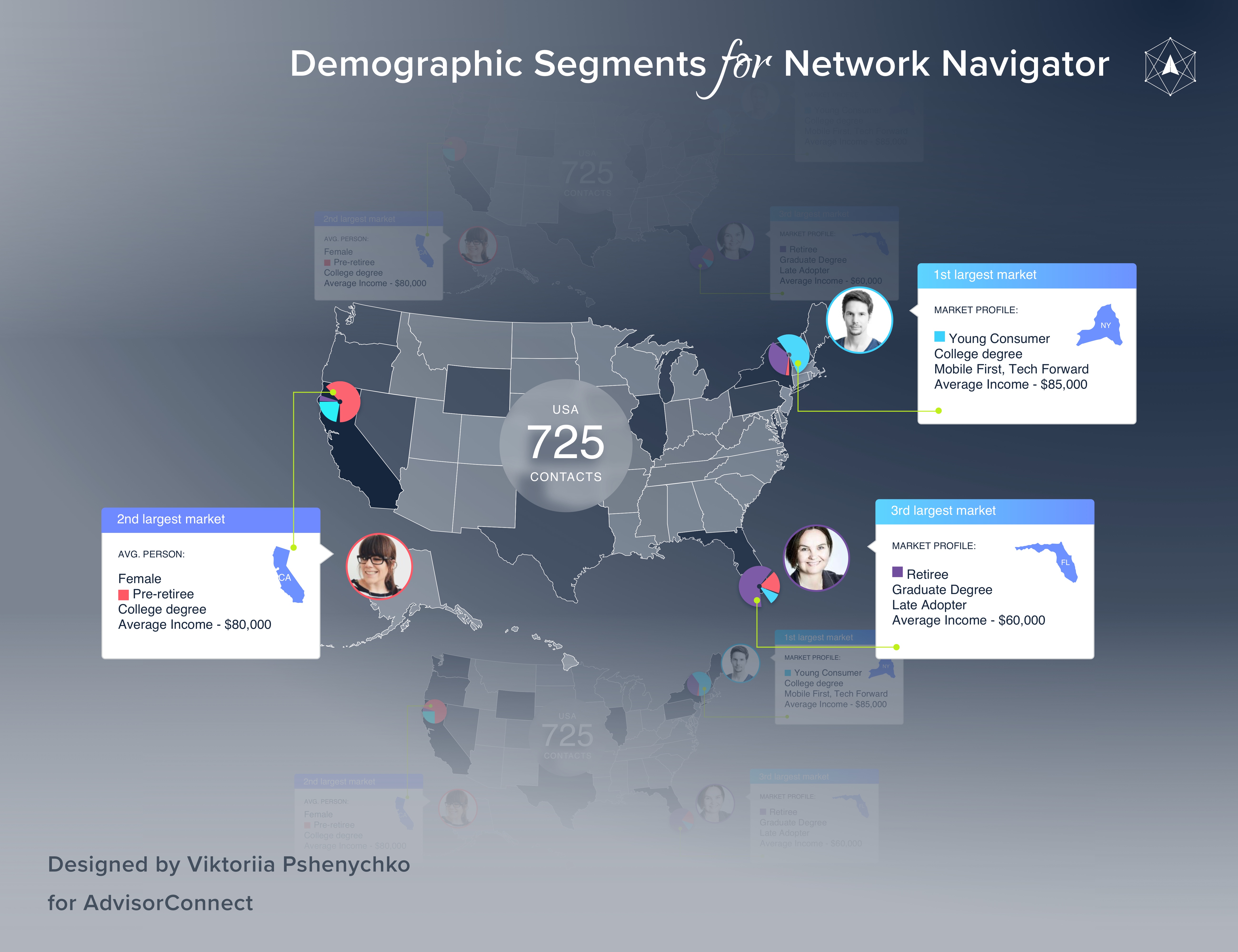
Automated Network Analysis
After importing contacts, the platform mapped the advisor's full network: geographic distribution, demographic breakdown, income profile, and institutional affiliations – with no manual entry required.
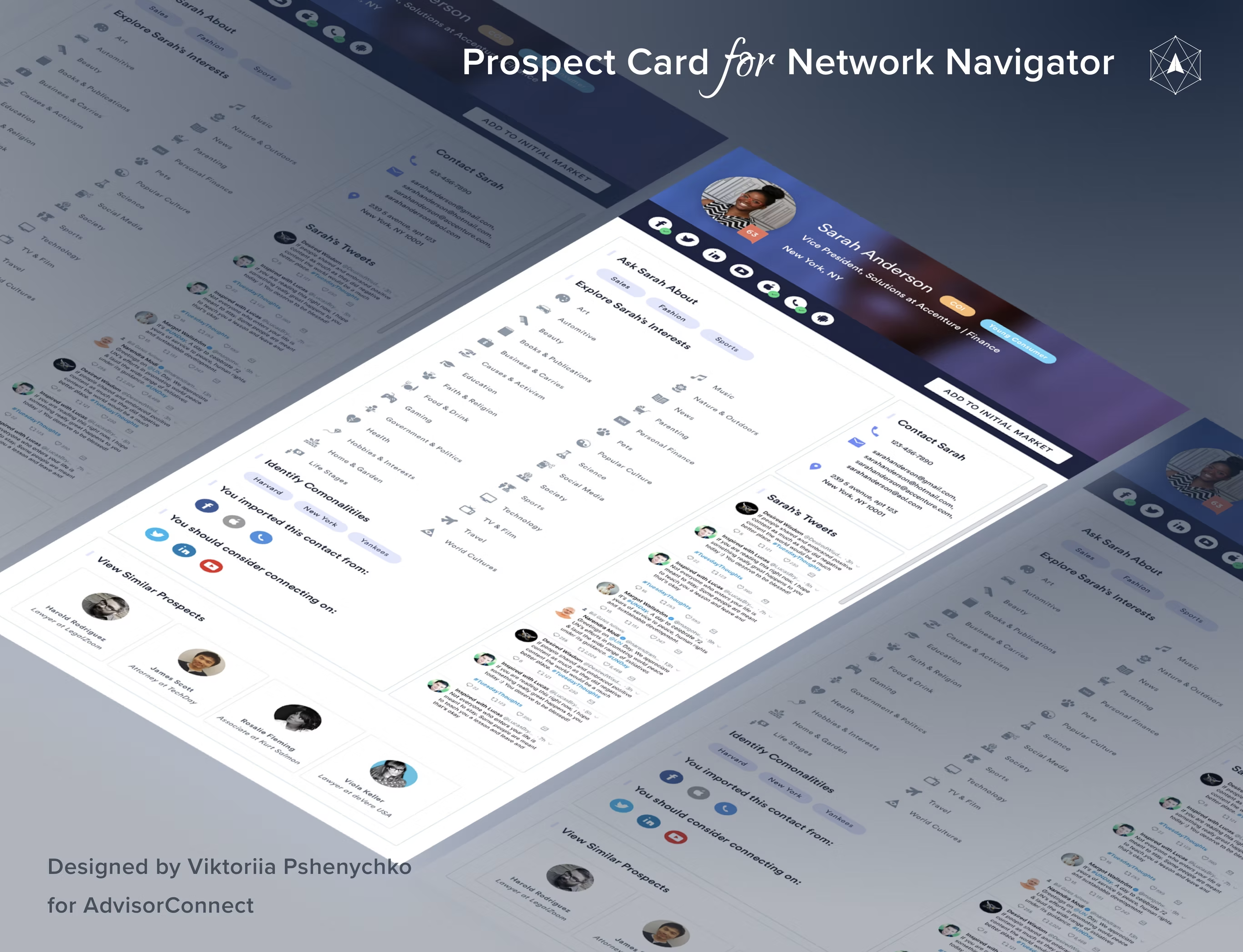
Target Market & Prospect List
The output was a filterable, ranked prospect list – a digital P200. Each contact surfaced with shared attributes, mutual connections, and one-tap Email and Call actions to move from list to conversation.
App Prototype
Explore the app.
A walkthrough of the AdvisorConnect mobile networking app – 8 screens covering onboarding, social account linking, contact analysis, and network discovery.
View App Screens
8 screens · Mobile app · Onboarding flow
Impact
Business outcomes across the enterprise.
Reduced time for new advisors to complete core onboarding workflows
Successful pilots launched with New York Life and Penn Mutual
Prospective enterprise clients attracted through stakeholder strategy visualization
Full product suite shipped across responsive web and mobile platforms
“I filled out the booklet, sent it in, and heard nothing for three weeks. I didn't know if I was doing it right, doing it wrong, or if anyone was even looking at it.
Reflection
What I learned.
This project shaped how I think about designing for institutional change. The advisors weren't the hardest people to design for – they were ready for something better. The harder challenge was designing for the enterprise buyers who had to believe the product before they could champion it internally. That pushed me to think about design artifacts not just as user-facing interfaces but as strategic communication tools: the stakeholder visualization we built wasn't a feature, it was a sales instrument. It changed how deals closed. I also learned something important about the relationship between ambiguity and attrition. The advisors who quit weren't failing – they were failing to receive feedback. The single most impactful design decision we made was surfacing progress indicators and manager visibility into the P200 flow. It didn't speed up the process; it made the process feel survivable. Clarity is retention design.